

meineBIG App Redesign – Health insurance made easy
Relaunch for the statutory direct health insurance fund

Introduction
In 1996, BundesInnungskrankenkasse Gesundheit (BIG for short) took a bold step by becoming Germany’s first statutory direct health insurance fund. At a time when traditional insurers relied on physical offices and paper forms, BIG embraced the future: offering online services and 24-hour telephone support to its 505,000 insured members. Their vision was clear: simplify healthcare access by making it digital-first.
Fast forward to recent years, the meineBIG app had become a crucial touchpoint for users, but it was falling short of expectations. Customers found themselves frustrated with clunky navigation, missing functionalities, and an outdated design. The demand for a seamless, modern, and accessible digital healthcare experience had never been higher. BIG knew it was time for a complete transformation: one that would reaffirm its commitment to innovation and user-centric design.
Problem Statement
-
Complex Navigation: Users struggled to find essential features due to a cluttered and unintuitive interface.
-
Limited Digital Services: Key insurance functions, such as document submission and account management, were either missing or difficult to access.
-
Lack of Personalization: The app did not offer tailored experiences based on user needs.
-
Inconsistent Design Language: The UI lacked consistency, making the app feel outdated and disconnected from BIG’s brand identity.
-
Poor Accessibility Compliance: The app did not fully adhere to accessibility guidelines, making it difficult for Senior Citizens/Differently-Abled users to navigate.
Research & Discovery
An extensive research was conducted to uncover user pain points and expectations.
Surveys and in-depth interviews provided valuable insights into frustrations, preferences, and interaction patterns. Competitive analysis benchmarked meineBIG against leading health insurance apps, while heatmaps and analytics revealed areas where users struggled or dropped.
These findings formed the foundation for a data-driven redesign focused on usability, efficiency, and user satisfaction.
Key Findings
-
Users needed a streamlined onboarding experience to quickly access core features.
-
Document submission was a high-priority feature, but the previous app required multiple unnecessary steps.
-
Users expected a unified dashboard displaying key health insurance information at a glance.
-
Security and trust were critical concerns; users wanted clear communication about data protection.
Design Process
01
Information Architecture & Wireframing
With insights in hand, the app’s information architecture was restructured to create a frictionless user journey.
Key structural changes included:
-
Home dashboard summarizing the most important actions (e.g., pending claims, messages, and coverage details).
-
Bottom navigation bar with clear sections: Home, Inbox, Services, Profile.
-
Search function to allow quick access to forms and information.
Low-fidelity wireframes were tested with real users to validate the new layout before proceeding to high-fidelity designs.

03
Usability Enhancements
-
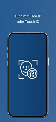
Seamless onboarding: A guided introduction for new users.
-
Document scanner integration: Users could snap photos of documents for instant submission.
-
Push notifications & reminders: Timely updates for pending insurance tasks.
-
AI-powered chatbot assistance: To answer common user queries.


02
UI Design & Branding
A fresh UI was developed based on BIG’s corporate identity but optimized for digital interactions:
-
Minimalist & modern design: Clean, uncluttered layouts with ample whitespace.
-
BIG’s brand colors (blue and white) were used for trust and familiarity.
-
Typography & Iconography: Readable fonts and clear, universally recognized icons for accessibility.
-
Dark mode support for better usability in low-light environments.

04
Accessibility Improvements
-
WCAG 2.1 Compliance with high contrast modes and screen reader compatibility.
-
Larger tap targets and button sizes for better touch usability.
-
Horizontal layout support with 200% viewing for improved readability and accessibility.
-
Multiple language support to cater to diverse users.
-
Optimized the entire app for tablet-size screens to ensure a seamless experience across all devices.


With a new design and user-friendly features, it clearly represents the digital concept of the direct health insurance company. In the future, this will be expanded to include the connection of the electronic patient record (ePA) and the management of personal digital health applications (DiGA).


Impact & Results
The redesigned meineBIG app was met with overwhelmingly positive feedback. Data-driven insights confirmed the transformation:
-
App store rating increased from 3.2 to 4.6 stars.
-
70% reduction in user drop-offs during key tasks like document submission.
-
45% increase in active users within the first 3 months post-launch.
-
80% faster task completion rate due to the new intuitive design.
-
Improved accessibility scores, making the app more inclusive.
Conclusion & Learnings
The meineBIG app redesign successfully transformed user experience through research-driven design decisions. The project highlighted the importance of:
-
User testing at every stage to validate design choices.
-
Prioritizing accessibility to make digital health services inclusive.
-
Leveraging data analytics for continuous improvement.